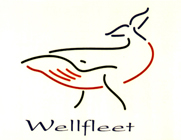
Project Wellfleet
Wellfleet was the code name for a product being developed at Hewitt Associates. I came up with the logo. It ended up being used on hats, mousepads, coffee cups, etc. People liked the upbeat look & feel.

ITivIT
With this I was just going for something simple that could be used in multiple color combinations and on a variety of different backgrounds.

Flashmap Systems
I added kind of a neat effect for this one by creating a rotating wireframe globe animation. (Click on image to view animated version).

Al's Body Shop
Following the success I'd had with the Wellfleet logo, I tried to do something similar here and come up with a minimalist type look.

Justapaulo (long)
This was my first attempt at a personal logo. I'd seen something similar with the dot inside a rounded character and liked how it looked.
Justapaulo (short)
After trying to use the original "paulo" design I found that it was too wide to work effectively for certain purposes. As a result I redesigned it with only two characters to so that it will work better in both landscape & portrait formats.
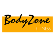
Body Zone
This is just a simple two-color logo. What's nice is that it's extremely flexible for a variety of purposes because the colors can easily be changed to give the logo a multitude of different looks.
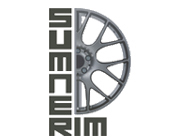
Sumner Rim
A current work in progress. The client wants a logo that incorporates the image of a wheel. Not yet the right balance yet but the core elements are starting to take on the good look.